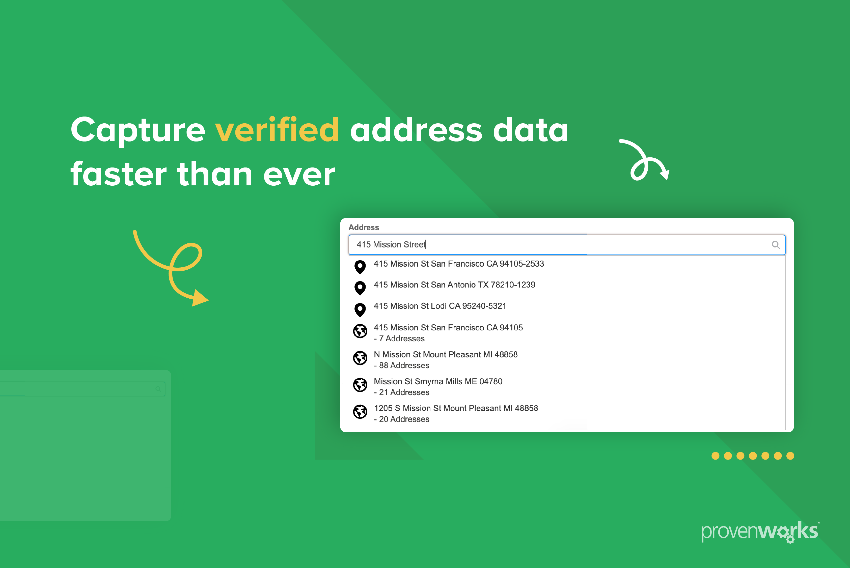
pw_ccpro-powersearch-core is a packaged AddressTools typeahead Lightning Web Component that lets a user search for
a verified address and select it. This guide covers embedding it inside your own Lightning Web
Component.
Prerequisites
The following must be true in the org for your wrapper to work at runtime:
| Requirement | Why |
|---|---|
| Lightning Web Security (LWS) enabled | A custom LWC can only reference a component from another namespace when LWS is enabled. |
| AddressTools installed and configured | The component reads its service configuration from AddressTools settings. Without it, the load error state is shown. |
| Running user has an AddressTools licence | Managed package licences are allocated per user. |
Running user has AddressToolsPremiumStdUser (or equivalent) |
Grants access to the pw_ccpro__ Apex classes and reference data the component queries. |
A custom permission set must be created and assigned to Experience Cloud users if needed.
Lightning Web Security
Wrapping pw_ccpro-powersearch-core in your own LWC crosses a namespace boundary, and that
is only supported under Lightning Web Security. With Lightning Locker enabled instead,
custom components are restricted to the c and lightning namespaces, so the component
cannot be referenced from your wrapper at all.
Enable it in Setup under Session Settings, using the Use Lightning Web Security for Lightning web components setting. This is an org-wide change affecting every custom component in the org, so test in a sandbox before enabling it in production.
Inputs
Every input is optional. Attributes are written in kebab-case in markup.
| Attribute | Type | Description |
|---|---|---|
label |
String | Label shown above the search field. Leave blank for the component’s own translated label. |
placeholder |
String | Hint text shown inside the search field while it is empty. Leave blank for the component’s own translated placeholder. |
value |
String | Text placed in the search field on load. A non-empty value runs that search straight away and opens the results. |
show-country-filter |
Boolean | Shows a country dropdown beside the search field so the user can narrow the search to one country. Defaults to false. |
allowed-country-codes |
String | Comma-separated ISO-2 codes. Limits every search to these countries, and supplies the dropdown contents when show-country-filter is true. Leave blank to search all countries. |
initial-country-code |
String | Has no effect unless show-country-filter is true. ISO-2 code identifying the country pre-selected in the country filter on load. Must be one of allowed-country-codes. |
preferred-country-code |
String | ISO-2 code. Prioritises search results from that country, including when the country filter is set to “All countries”. Also pre-selects it in the country filter when initial-country-code is not set. |
Country configuration
All inputs require countries to be specified as ISO 2-letter codes (GB, US, CA).
Which countries a search covers
- When the country filter is visible with a specific country selected, the search is limited to that country only.
- When the country filter is set to “All countries”, or the country filter is disabled,
results are limited to the countries specified in
allowed-country-codes. - When
allowed-country-codesis blank, all countries are returned, withpreferred-country-codeweighting the response in favour of results in the specified country.
The country filter always offers “All countries” alongside the countries specified in
allowed-country-codes. When show-country-filter is true and allowed-country-codes is
blank, it lists every country enabled in the Countries object supplied with the package.
“All countries” means every country in the filter, not a global search. Where
allowed-country-codes is set, selecting it searches only those countries;
allowed-country-codes is never widened by the user’s choice.
initial-country-code and preferred-country-code
Both can pre-populate the country filter on component load, and initial-country-code wins
where they disagree. preferred-country-code still affects result order when “All
countries” is selected in the country filter.
Example
show-country-filter    = true
allowed-country-codes  = "GB,US,CA"
initial-country-code   = "GB"
preferred-country-code = "GB"
| Outcome | Result |
|---|---|
| Country filter contents | “All countries”, GB, US, CA |
| Country filter value on load | GB, from initial-country-code |
| Search with GB selected | GB only |
| Search with “All countries” selected | GB, US and CA, with GB results favoured |
| An Australian address | Never returned |
Configuration warnings
The component shows a warning panel above the search field when:
- an entered ISO code is not a recognised country code
- a specified country does not exist in the org’s Countries object
initial-country-codeis not one of the configuredallowed-country-codes
Warnings are displayed to the user rather than thrown or dispatched, so there is nothing for your wrapper to catch.
Outputs
The selected address is available in two ways: an event fired when the user makes a selection, and public properties readable at any time afterwards.
Event: addressselected
Dispatched each time the user picks an address from the results and the full record has been retrieved. It does not bubble, so listen on the element itself.
handleAddressSelected(event) {
    const address = event.detail.address;
}
Address fields
event.detail.address is a plain object containing all of the fields below. Every value is
a String, and any field the data provider has no value for is an empty string rather than
null or undefined.
| Field | Description |
|---|---|
organisationName |
Organisation or company name. |
subBuildingName |
Flat, unit, or other sub-building name. |
buildingName |
Building name. |
buildingNumber |
Building or premise number. |
dependentThoroughfare |
Secondary or dependent street name. |
thoroughfare |
Street name only, such as High Street. |
dependentLocality |
Dependent locality or district. |
postTown |
Post town or city. |
postcode |
Postcode / ZIP Code. |
administrativeArea |
Administrative county or equivalent area. |
state |
Largest administrative division, such as a US state or Canadian province. Empty where a state is not mandatory and would duplicate the city. |
country |
Country display name, resolved from AddressTools reference data and honouring alternative country name mappings. Falls back to the ISO 2-letter code when the country cannot be resolved. |
countryIso2 |
Uppercase ISO 2-letter country code returned by the service, such as GB or US. |
formattedStreet |
The complete street address line, such as 10 High Street, assembled from the address components that typically make up a delivery address line. Multi-line street data is joined with newlines. |
latitude |
Latitude, as a string, when geocoding is enabled. |
longitude |
Longitude, as a string, when geocoding is enabled. |
geocodeAccuracy |
Reserved for future use. |
propertyUse |
Address-use classification such as Residential, Commercial or Mixed. |
formattedAddressLabel |
Complete address display label, formatted to the country’s postal specification. |
Latitude and longitude are strings because the same values are exposed as Flow screen properties, which have no decimal type.
Reading the fields as properties
Every field above is also a public property, so the current selection can be read directly from the element at any time:
const powerSearch = this.template.querySelector("pw_ccpro-powersearch-core");
const postcode = powerSearch.postcode;
The properties and the event payload always hold the same values. Handling the event is recommended; the properties are useful when you need a value later, such as on form submit.
Flow-only features
These exist only to support the component’s Flow Screen target. Leave them unset in a custom LWC and handle validation in your own wrapper.
| Feature | Why it is Flow-only |
|---|---|
required |
Enforced through the Flow Screen validation lifecycle, which calls the hooks below for you. |
flow-auto-advance |
Asks Flow to move to the next screen when an address is selected. |
LWC Examples
Minimal
<template>
  <pw_ccpro-powersearch-core onaddressselected="{handleAddressSelected}">
  </pw_ccpro-powersearch-core>
</template>
import { LightningElement } from "lwc";

export default class MinimalExample extends LightningElement {
  handleAddressSelected(event) {
    this.address = event.detail.address;
  }
}
Fixed country set, no visible filter
allowed-country-codes limits the search to GB and IE, no country filter is shown, and
results favour GB addresses:
<template>
  <pw_ccpro-powersearch-core
    label="Delivery address"
    allowed-country-codes="GB,IE"
    preferred-country-code="GB"
    onaddressselected="{handleAddressSelected}"
  ></pw_ccpro-powersearch-core>
</template>
Full example with filter and result rendering
<template>
  <pw_ccpro-powersearch-core
    label="Search address"
    placeholder="Enter an address"
    show-country-filter="{showCountryFilter}"
    allowed-country-codes="GB,US,CA"
    initial-country-code="GB"
    preferred-country-code="GB"
    onaddressselected="{handleAddressSelected}"
  ></pw_ccpro-powersearch-core>

  <ul>
    <template for:each="{addressEntries}" for:item="entry">
      <li key="{entry.key}">{entry.key}: {entry.value}</li>
    </template>
  </ul>
</template>
import { LightningElement } from "lwc";

export default class WrapPowersearchCore extends LightningElement {
  selectedAddress;

  showCountryFilter = true;

  get addressEntries() {
    return this.selectedAddress
      ? Object.entries(this.selectedAddress).map(([key, value]) => ({ key, value }))
      : [];
  }

  handleAddressSelected(event) {
    this.selectedAddress = event.detail.address;
  }
}